I’m happy to announce that I have a new line of Custom letterpress Notecards over on the website. I have some easy templates to choose from, and we can work together to customize your order. Let me know if you have any questions!
I’m happy to announce that I have a new line of Custom letterpress Notecards over on the website. I have some easy templates to choose from, and we can work together to customize your order. Let me know if you have any questions!
Posted in Letterpress | Leave a Comment »
Posted in Letterpress | 1 Comment »


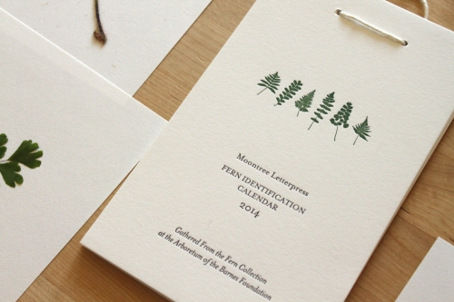
I’m just finishing the beginning stages of one of my favorite projects of all time. This year I entered the Horticulture Program at the Barnes Arboretum. It is a three year intensive program that Laura Barnes began in 1940, and focuses on art and horticulture. It has already been a huge creative inspiration for me, and I’m very excited about the months and years of classes to come.
One of the many amazing features at the Barnes Arboretum is the Fern Collection. With over 200 species, it is one of the largest collections in the world. I’ve been given the incredible privilege of using some of the specimens in a letterpress fern project. I’m printing a variety of items, including cards, bookplates, calendars and more. They will be finished by the end of the month and available in my Etsy shop, and at the Barnes Museum gift shop in Philadelphia.
I have many more photos on my Facebook page, please find them HERE.
Posted in Letterpress | 1 Comment »


Many people know that Top Chef is one of my FAV-OR-ITE shows, so you can imagine how happy I was today working on this batch of promo coasters for Top Chef Kevin Sbraga’s upcoming Philly restaurant, The Fat Ham. Not a bad Tuesday in the studio. :)
Posted in Custom, Letterpress | Leave a Comment »
Posted in Letterpress | 1 Comment »
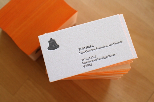

Business cards for Brooklyn film aficionado, Tom Hall. Printed on 236# Reich Savoy. Find some more shots here. :)
Posted in Business Card, Custom, Letterpress | Leave a Comment »
Posted in Letterpress | 2 Comments »


Some photos of the cherry pies I made from my neighbor’s tree. You can see a few more photos here, hope everyone has a safe and happy July 4th!
Posted in Plants / Nature, Studio Life | 1 Comment »


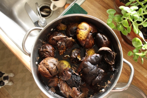
After a morning of printing, I found the same colors on my chopping board. :)
Posted in Letterpress, Studio Life | 1 Comment »